

( 00-01 )
PROJECT
Gentech Automations had a product worth selling and nothing to sell it with. No brand, no site, no visual language. Built from scratch in three weeks.
A full brand and web UI engagement covering identity system and a five-page Framer site. The brief was clear: an AI automations agency targeting growing businesses needed to look like it belonged in the same room as the tools it builds — technical, precise, and impossible to mistake for a generic SaaS.

( 00-02 )
PROCESS
Brand and web were developed in parallel, each informing the other. The identity established the visual logic; the site proved it could hold up across five pages and real content.
Wordmark
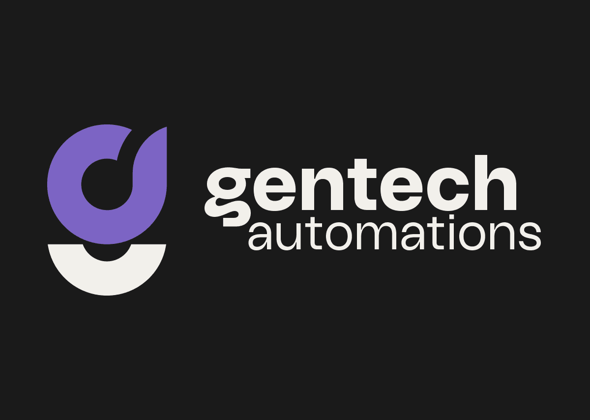
The wordmark is a stacked composition. "gentech" in bold Sagace, "automations" in regular weight directly beneath. Same typeface, two weights. The hierarchy is carried entirely by weight contrast, not by switching faces. Authority first, context second, nothing redundant.
Typography
Sagace (primary) and Avant Garde (secondary) are both geometric sans-serifs, which means the hierarchy is carried entirely by weight contrast rather than mixing typeface families. Sagace handles headings and the wordmark: squarer, heavier, more authoritative. Avant Garde handles body copy and UI text: rounder, lighter, more sustained. Same visual language, different registers.
Brandmark
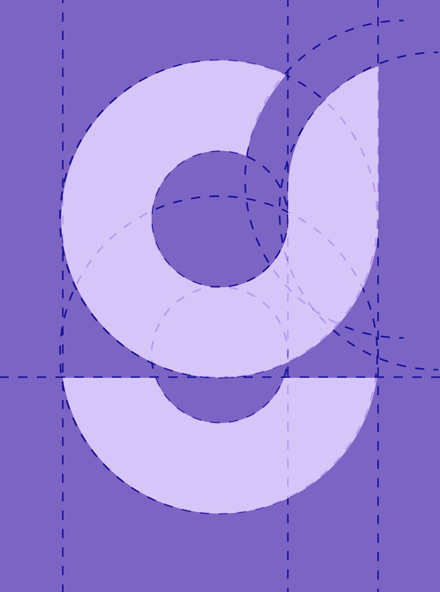
The client came in with one constraint — the brandmark had to be a "g", but not a boring one. During the research phase, the Stagtic typeface surfaced: its lowercase "g" is a split-circle geometric letterform that already reads as systematic and gridded without being engineered that way. The decision was recognizing the right form, not drawing from scratch.
Color Palette
Four values:
Charcoal (
#1A1A1A)Raw White (
#F2F0EB)Light Lavender (
#D6C6F7)Electric Violet (
#7C64C4).
Structurally it's still a monochrome-plus-single-accent system. Light Lavender is a tint of the same hue, not a second color. Violet is reserved exclusively as a signal color: every instance of it flags something intelligent or active, the way an indicator light does in interface design.
Web UI
Five pages designed in Framer:
Home
Services
Process
About
Contact.
Dark-dominant throughout, consistent with the established convention for technical and AI-facing products. Violet appears at interaction points and emphasis states only, never decoratively. The site's job was to guide a skeptical operator from "what is this" to "I need this" without padding the process — the same principle Gentech applies to their own builds.






( 00-03 )
OUTCOME
A complete system — brand and web — built in three weeks, with nothing carried over from before.
The identity and site work as a single argument. The brand's bisected mark and strict violet-as-signal logic translate directly into the UI's interaction states and accent use, so nothing feels designed separately. For an agency selling precision and speed, the system reflects both — restrained enough to read as technical, direct enough to not waste the visitor's time.
( 00-03 )
DISCOVER MORE


