
Branding
Built for brands and labels that refuse to look forgettable.

( 00-01 )
PROJECT
Obsidian Studio needed an identity as deliberate as the work they make. Built for independent musicians and small labels who refuse to blend in.
A four-week engagement covering the complete visual identity system: wordmark, brandmark, typography, and color palette. The goal was a brand that felt professional without feeling corporate — sharp enough to hold its own, raw enough to fit the underground.

( 00-02 )
PROCESS
Every decision was made to serve the system, not just the moment. The wordmark, type pairing, brandmark, and palette were developed as a single interconnected logic.
Wordmark
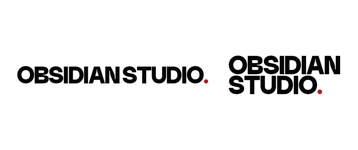
GC Gatuzo was chosen for two reasons: the way its density sits against DM Sans at contrasting scales, and the groovy, near-stencil quality of its letterforms that gives the wordmark personality without shouting. The red full stop was intentional from the start, the only chromatic element in an otherwise monochrome lockup, functioning less as punctuation and more as a stamp.
Typography
GC Gatuzo handles display: headlines, the wordmark, anywhere the brand needs to speak first. DM Sans handles everything else. The pairing is a division of labor: one face carries voice, the other carries legibility. They don't compete because they were never meant to operate at the same size.
Brandmark
The process went through two dead ends before landing. An obsidian shard read too much like crystal. An O+S interlock came out generic. The breakthrough was simpler: extract the "O" and the red period already living in the wordmark, rebuild them as concentric rings, and enclose the result in a rectangle referencing an artist's canvas. The brandmark shares literal geometry with the wordmark rather than just a stylistic resemblance.

Color Palette
Three values: Obsidian Black, Raw White, and Ignite Red. Red was a deliberate choice. On a black and white canvas, it's the only hue that demands attention without needing support. It's used exclusively at emphasis points so every instance of it lands as a fixed focal point rather than decoration.


( 00-03 )
OUTCOME
The result is a system with two registers. Polished enough for professional contexts, rough enough for the underground.
The identity performs across touchpoints without losing its edge. Dark, high-contrast surfaces let the palette breathe. The brandmark scales cleanly from business card to sticker without softening. For a studio whose clients are independent musicians and small labels, the system carries the right tension: structured but not sterile, precise but not corporate. That's the fit.
( 00-03 )
DISCOVER MORE


