

( 00-01 )
PROJECT
Highline Beverage Co. wanted to break the cold brew shelf. A category dominated by browns, blacks, and forest greens. Three cans that couldn't be ignored.
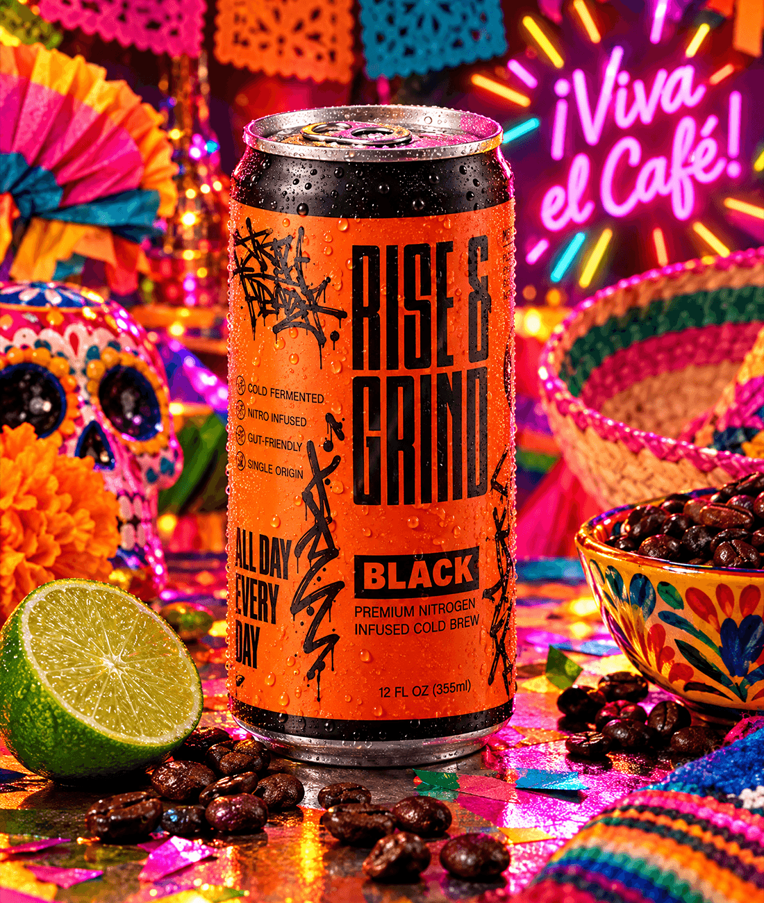
A two-week label design engagement for three SKUs: Black, Mocha, and Oat Latte. The brief was explicit: "Neon Fiesta meets Minimalist Brutalism," targeting an audience that buys for ritual and status as much as caffeine. Deliverables were print-ready flat wrap files for 3D mockup production, with soft-touch matte varnish and spot gloss on type specified at print.

( 00-02 )
PROCESS
The brief had a clear creative direction. The design decisions were about executing it with enough specificity that the result felt like a system, not just three loud cans.
Color Palette
Electric orange for Black, hot pink for Mocha, sunny yellow for Oat Latte. The three neons were client-directed, chosen specifically to invert the category convention. Each color is flat, fully saturated, and unmodulated. No gradients, no softening. Against a shelf of muted, earthy cold brew packaging, the cans read as interruptions before the consumer reads a single word.
Typography
The brief called for a deliberate typographic clash: clean geometric sans against raw graffiti. Four faces, four distinct roles with no overlap. Psilograph carries the "RISE & GRIND" hero wordmark at maximum scale. Condensed, dramatic, unmissable. Black Junkiest provides the graffiti tag texture scattered across the label. Raw, handmade, intentionally illegible in places. Bebas Neue handles mid-hierarchy callouts: "ALL DAY EVERY DAY", section headers, structural elements. Acumin Variable handles everything that needs to be read: flavor names, body copy, nutrition facts. The clash is not decorative. It is the brand's core tension made typographic: aspiration and grit, polish and street, ritual and rawness.
Label Design
The 360° wrap is treated as a full composition rather than a front/back split. The back panel runs nutrition data styled as a stock ticker with green and red arrows against the neon field, turning regulatory content into something that fits the brand's "achiever" positioning. Each variant has a Daily Affirmation at the can base, one line per flavor that extends the brand voice into a touchpoint most labels waste on fine print.



( 00-03 )
OUTCOME
Three cans that do exactly what the brief asked. Impossible to miss, built for a shelf that wasn't expecting them.
The neon + graffiti system works because neither element softens the other. The clean structural layout keeps the labels readable and intentional; the raw typographic texture keeps them from looking like every other "bold" beverage rebrand. For an audience that buys on ritual and status, the finish does its own work. Soft-touch matte with spot gloss on type means the can feels as considered as it looks.
( 00-03 )
DISCOVER MORE


